
Open a component in your editor from the page
Point at any element on the page and jump to the file and line that renders it. Off by default; one option turns it on.
Turn it on
Section titled “Turn it on”import {defineConfig} from 'vite';import {litPlugin} from '@oddsquad/vite-plugin-lit';
export default defineConfig({ plugins: [litPlugin({sourceOverlay: true})],});Prefer to leave the config alone? Every option also reads from the
environment, so a personal .env.local works just as well.
LIT_PLUGIN_SOURCE_OVERLAY=trueLIT_PLUGIN_SOURCE_OVERLAY_EDITOR=zedUse it
Section titled “Use it”-
Press Ctrl+Shift+S (⌘⇧S on a Mac) in the page to arm the picker.
-
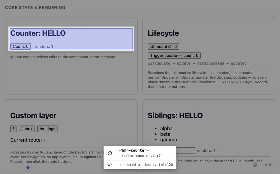
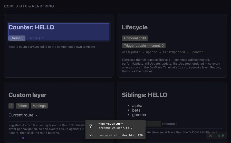
Move the pointer. The element under it is outlined, and a panel shows its tag name and source file, plus a second row for the line that renders it when it has one.
-
Press ↑ to outline the element around it instead, and ↓ to go back in. The tooltip names where each key goes.
-
Hold Ctrl (or ⌘) and click the element to open that file in your editor at that line. Add Shift to open the line where that element is written instead, see Where an element is rendered. While you hold the keys, the tooltip lights up the row the click will open.
-
Press the same keys again to put the picker away without opening anything.
A plain click, without the modifier, hands the element to the DevTools Components tab instead, when the panel is set up.
Where an element is rendered
Section titled “Where an element is rendered”The overlay and the Components tab open the file that declares a component.
The dev transform also stamps a data-lit-source="file:line:column"
attribute on every custom element written in an html or svg template, and
the Components tab uses it for a Rendered at link to the tag that created
that instance. The overlay reads it too: when the hovered element has one, a
second row in the tooltip reads rendered at file:line, and
Ctrl/⌘+Shift+click opens that spot in your editor,
at its column, instead of the declaration. Without a call site it opens the
declaration. A library element picked with hosts: 'lit' has no declaration
to show, so its call site is the only row, and Ctrl/⌘+click opens it.
Either way, the highlighted row is the one the click opens. The tooltip is
only a readout: the pointer passes through it to the page, so there is
nothing in it to click.
Custom elements written straight into an HTML entry file such as
index.html get the same attribute, with the line and column in that file.
That includes elements inside a <template>, whose clones keep it. Comments,
<script> and <style> are left alone.
The attribute is added only on the dev server and only while sourceOverlay
is on, so it never reaches a production build. It is also visible in the
page’s DOM and in your own selectors, which is worth knowing if a test matches
attributes exactly.
Choose your editor
Section titled “Choose your editor”The built-in keys are vscode (the default), cursor, zed, idea and
windsurf. An unknown key falls back to VS Code.
import {defineConfig} from 'vite';import {litPlugin} from '@oddsquad/vite-plugin-lit';
export default defineConfig({  plugins: [litPlugin({sourceOverlay: {editor: 'zed'}})],});
Anything else is a {name, url} pair. The url function receives the
absolute path and the line number, and returns the URL to open. A third
argument, the column, is passed when opening a call site; you can ignore it.
import {defineConfig} from 'vite';import {litPlugin} from '@oddsquad/vite-plugin-lit';
export default defineConfig({  plugins: [    litPlugin({      sourceOverlay: {        editor: {          name: 'My Editor',          url: (path, line, column = 1) =>            `my-editor://open?file=${path}&line=${line}&column=${column}`,        },      },    }),  ],});
The DevTools panel’s source links open the file in the editor you chose, or in
whichever one the panel’s Settings tab overrides it with, for vscode,
cursor, zed and idea. The in-page overlay’s own click follows the same
choice. windsurf and custom editors have no matching launch command, and
neither has a project that never picked one: those links open in the editor
launch-editor auto-detects, set LAUNCH_EDITOR to steer it. Your choice
still shapes the overlay’s URL-scheme fallback either way.
Opening normally goes through a dev-server middleware and falls back to the editor’s URL scheme when the server is unreachable, as in a StackBlitz preview. DevTools architecture explains why, and why the DevTools panel’s own source links take a different route.
Change the shortcut and other options
Section titled “Change the shortcut and other options”import {defineConfig} from 'vite';import {litPlugin} from '@oddsquad/vite-plugin-lit';
export default defineConfig({ plugins: [ litPlugin({ sourceOverlay: { key: 'i', throttleMs: 50, hosts: 'lit', workspaceRoot: '/Users/me/projects/app', exclude: (el) => el.tagName.startsWith('MY-INTERNAL-'), onSelect: (info) => console.log(info.tagName, info.source.filePath), }, }), ],});-
keyis the letter combined with Ctrl+Shift, so'i'gives Ctrl+Shift+I. Defaults to's'. Avoid'e': it collides with the panel’s Meta+Shift+E pick shortcut. -
throttleMsthrottles pointer-move hit testing. Defaults to50. -
workspaceRootprefixes source paths, for when your editor needs absolute ones. Unset by default. -
hostsis'source'(the default) to pick only your own components, or'lit'to pick any Lit element, a component library’s included. Those have no source, so a click selects them in the DevTools Components tab. -
excludereturnstruefor elements the picker should skip. -
onSelectfires with the picked element’s info:tagName,componentName,source, andcallSite(file, line and column of the template that wrote it) when the transform stamped one. It does not fire for an element with nosource, such as a library one. The default action still runs after it.
The picker is shared: the DevTools Components tab reuses it for its Pick
button, so element picking there needs sourceOverlay enabled too.