
Inspect live components
See every Lit element on the page, its reactive properties and its source file, and watch which ones re-render. Everything here works without recording.
Browse the tree
Section titled “Browse the tree”The Components tab shows a live, hierarchical tree of the Lit elements on the page, descending through shadow roots. Click a row to select it. Hover a row to outline that element in the page. Hold Shift while hovering to outline every element with the same tag at once, in dashed boxes, and to mark their rows in the tree. That shows how often a component is used and where.
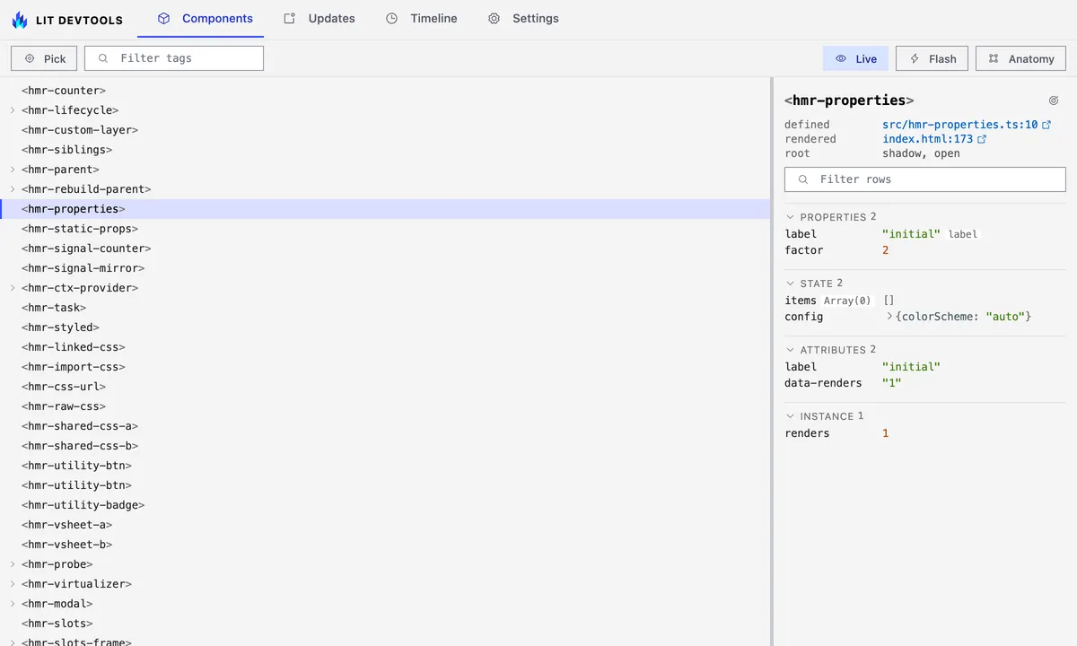
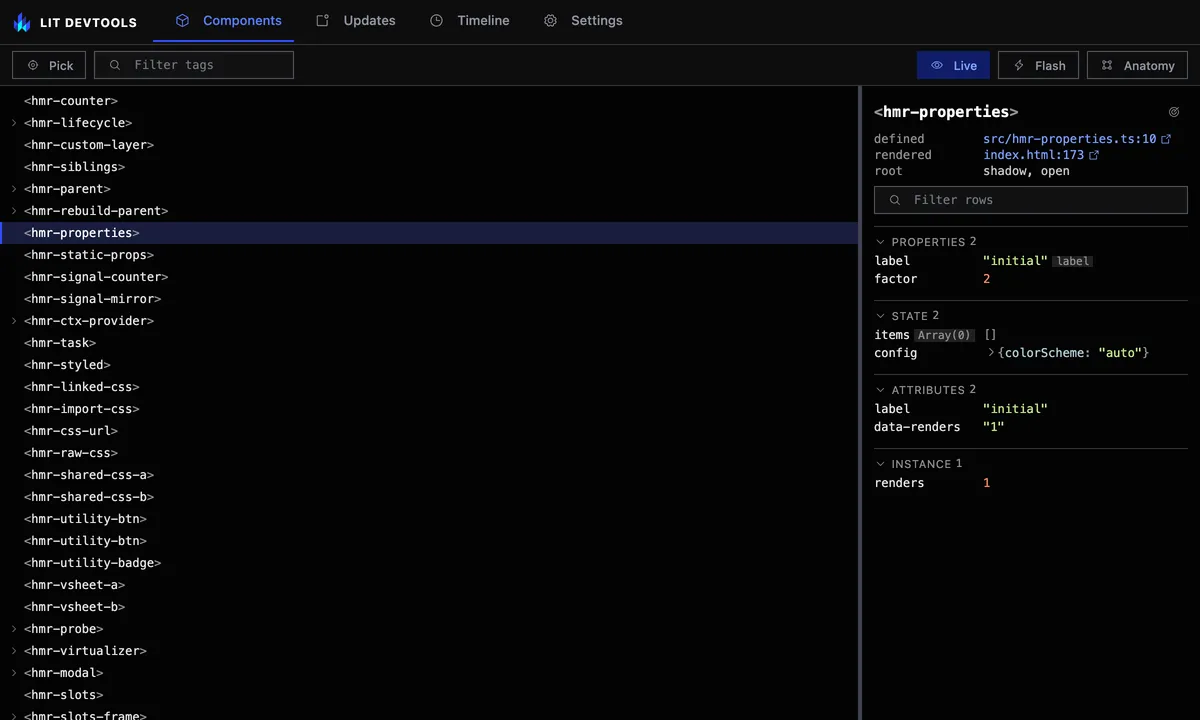
The tree follows the page as components appear and disappear; see Follow changes live to pause it.
To find an element on a busy page, type in the Filter tags box in the toolbar. The tree narrows to elements whose tag or class name contains the text, ignoring case, and the box shows how many match. Each match keeps its ancestors, dimmed, so you can see where it sits, and every kept branch shows open. Clearing the filter, with the clear button or Escape, brings back the branches you had expanded.
A tag that nothing has defined, because the import is missing, the tag is
misspelled or its chunk has not loaded, stays in the tree where the page uses
it, with a not defined chip. Selecting it shows the same chip, a note on the
usual causes, and the rendered line when the template position is known;
it has no properties because it has no class. Once the tag is defined the
chip goes away on its own, as long as the tree is live.
A custom element another library defined, a vanilla web component or one built
with Stencil or FAST, also stays in place, with a muted not Lit chip, so the
tree shows what really wraps your components. Selecting it shows its
attributes and slots and a short note; it has no properties or updates because
Lit doesn’t render it. Plain HTML elements are still left out.
A component Lit’s development build has warned about carries an amber
n warnings chip on its row, and the Components tab shows an amber count
of the components Lit warned about, next to the red HMR issues count. Every
instance of a warned tag shows the chip, because Lit warns once per message.
Select the row to read the warnings in the
details pane.
When an edit is hot-patched in place, a line above the tree reads
Patched <tag> ×N in M ms (childState: …) for the most recent patch. It is not
an issue, so the tab badge does not count it. Components that could not be
patched appear in the HMR issues banner instead.
Read the details pane
Section titled “Read the details pane”Selecting an element fills the pane on the right. The tag name heads it, with
a status beside it only while one applies: pending while an update is queued,
not rendered before the first update has run, and n warnings when Lit’s
dev build has warned about the component. Under the tag, three short
lines say where the class is defined, where this instance is rendered,
and its root: shadow with its mode and delegatesFocus, or light DOM.
Below those come the sections, each shown only when it has rows. Properties lists the public reactive
properties, with a badge naming the attribute a property reflects to. A
property declared with options beyond Lit’s defaults gets one more badge per
option: hasChanged and converter for a custom function, noAccessor,
useDefault, and no attr for attribute: false. A plain @property() has
none. The badges only say an option is set; no custom function is called.
State lists internal @state. Attributes lists the attributes the
element currently carries, as quoted strings.
Values are coloured like code: keys, strings, numbers, keywords and class
names each take their own colour. A value too long for its row moves to its
own line under the name, and an object or array too wide for that line opens
up one entry per line. Where the preview does not already say what a value
is, a muted tag after the name does, such as Array(3) or Date.
Previews go two levels deep and show the first eight items of an array,
object, Map or Set, with a count of the rest. A Map lists its entries
as key => value.
To see past those limits, click the caret before an object, array, Map or
Set. The row opens one level, listing each key, index or entry with its own
preview, and any child that holds more has a caret of its own. Each level
lists up to 100 children and counts the rest. Open levels follow the value as
it changes, and selecting another element closes them. A snapshot has no live
page to ask, so it shows no carets.
Hover a row, or tab to it, to show a copy button at its right edge. It copies the value as the pane shows it, which is the preview and not the live object, so a truncated value copies truncated. An attribute copies its text without the quotes.
Each section heading shows how many rows it holds. Click a heading to fold the section. It stays folded as you select other elements and after a reload.
To find one row in a large component, type in the Filter rows box under the tag name. Every section, slots and parts included, narrows to rows whose name or value contains the text, ignoring case. Headings then count matches out of the total, sections with no match drop out, and folded sections open until the filter is cleared. The filter stays set as you select other elements, so you can compare one property across several. Press Escape to clear it.
Instance lists what the reactive properties do not cover: @lit/task
status with its value or error, @lit-labs/signals signals, other reactive
controllers (named by the field that holds them, else by class) and plain class
fields, at most 24 in all. A muted tag after each name gives its kind, and
hovering it shows the type. A plain field shows its type tag instead, and a
task adds its status as a dot: amber while pending, green when complete, red
on error. The section has limits. A computed signal shows as
(computed) and is never evaluated, since that would run your code.
Controllers are found through a private Lit field, so a Lit build that renames
it lists none. Values use the same previews as properties.
@lit/context providers and consumers, including ones made with @provide
and @consume, are tagged context and show the context key (a Symbol’s
description, or the string) next to the name. The value expands like a
property. A consumer row links to the provider element it reads from, and a
provider row links to its consumers; clicking a link selects that element.
The provider is found by walking up from the consumer and, for a subscribing
consumer, confirmed against the provider’s subscriptions. A consumer that
did not set subscribe leaves no trace, so a provider cannot list it. A
subscribed consumer’s row follows the provider’s value live. A provider whose
value is set directly, without the host updating, refreshes on its next
update.
Warnings appears above the tables when Lit’s development build has warned
about the component, for example change-in-update for an update scheduled
from inside updated(). Each row has Lit’s message and its code, which links
to the explanation on lit.dev. Lit warns once per message, so the list
describes the component and every instance of that tag shows it. A production
build of Lit issues no warnings, so the section never appears there. The same
list is in the warnings field that lit_component-details returns to
agents.
Slots and Parts show how the element composes its content; see See an element’s slots and parts.
The playground fixture below fills Properties, State and Attributes. The two marked @property
declarations land under Properties, label with an attribute badge; the two
marked @state declarations land under State.
import {LitElement, css, html} from 'lit';import {customElement, property, state} from 'lit/decorators.js';
/** * Wider reactive-property surface: a reflected `@property`, a numeric * `@property`, and array/object `@state` values — all must survive a hot * patch, and the accessors must stay functional afterwards (assignments * still reflect and re-render). */@customElement('hmr-properties')export class HmrProperties extends LitElement {  static override styles = css`    .badge {      font-size: 0.8em;      color: var(--muted, #666);    }  `;
  @property({type: String, reflect: true})  label = 'initial';
  @property({type: Number})  factor = 2;
  @state()  private items: string[] = [];
  @state()  private config = {colorScheme: 'auto'};
  private renders = 0;
  override render() {    return html`      <h2>Properties: HELLO</h2>      <p id="label">label: ${this.label}</p>      <p id="factor">factor: ${this.factor}</p>      <p id="items">items: ${this.items.join(',') || '(none)'}</p>      <p id="color-scheme">color-scheme: ${this.config.colorScheme}</p>      <button id="add-item" @click=${this.addItem}>add item</button>      <button id="toggle-color-scheme" @click=${this.toggleColorScheme}>        toggle color scheme      </button>      <span class="badge" id="badge">renders: 0</span>    `;  }
  override updated() {    this.renders++;    this.setAttribute('data-renders', String(this.renders));    const badge = this.renderRoot.querySelector('#badge');    if (badge !== null) {      badge.textContent = `renders: ${this.renders}`;    }    // Apply the color-scheme state to the page. `auto` removes the attribute    // so the OS preference drives via the document `color-scheme` (declared by    // the <meta> in index.html) + `light-dark()`; `light`/`dark` pin    // [data-color-scheme] as a manual override. Because the @state survives a    // hot patch and this runs after the patch's re-render, the choice survives    // too.    if (this.config.colorScheme === 'auto') {      delete document.documentElement.dataset['colorScheme'];    } else {      document.documentElement.dataset['colorScheme'] = this.config.colorScheme;    }  }
  private addItem() {    this.items = [...this.items, `item${this.items.length + 1}`];  }
  private toggleColorScheme() {    // Flip the *resolved* scheme: from `auto` that's the current OS preference,    // so a dark system toggles to light (and vice versa). An explicit    // light/dark just inverts.    const resolved =      this.config.colorScheme === 'auto'        ? window.matchMedia('(prefers-color-scheme: dark)').matches          ? 'dark'          : 'light'        : this.config.colorScheme;    this.config = {colorScheme: resolved === 'dark' ? 'light' : 'dark'};  }}
/** * The non-decorator path: `static properties` plus a plain * `customElements.define()` call. */export class HmrStaticProps extends LitElement {  static properties = {    value: {state: true},  };
  declare value: number;
  private renders = 0;
  constructor() {    super();    this.value = 0;  }
  override render() {    return html`      <button id="static-increment" @click=${() => this.value++}>        Static count: ${this.value}      </button>      <span id="badge">renders: 0</span>    `;  }
  override updated() {    this.renders++;    this.setAttribute('data-renders', String(this.renders));    const badge = this.renderRoot.querySelector('#badge');    if (badge !== null) {      badge.textContent = `renders: ${this.renders}`;    }  }}customElements.define('hmr-static-props', HmrStaticProps);
The pane refreshes in place as the selected element updates, and each row
whose value just changed lights up briefly. Click the
defined link to open the class in your editor. When the element was written
in an html template, the rendered link opens that template at the line
and column of the tag, so you can tell which usage produced this instance.
Elements created any other way have no such line. Click the target
button beside the tag name to scroll the element into the middle of the page and outline it for a
moment, which helps when it sits below the fold. If the element leaves the
page, the pane says so instead of showing stale values.
Read a component’s documentation
Section titled “Read a component’s documentation”The pane adds what the component’s documentation says about it, read from its JSDoc for your own components or from a Custom Elements Manifest for a library’s:
- About holds the component’s summary and description, with long text folded to a few lines behind more. Hover the icon at the end of its heading to see where they came from: the source file, or the package and manifest file.
- A documented property, attribute, slot or part has a dotted underline; hover it to read the description.
- Events lists the events the class says it fires, with their type.
- CSS properties lists the custom properties it reads, with any default.
- A
deprecatedchip beside the tag name repeats the reason given.
Your own components
Section titled “Your own components”Your project’s components need no manifest. While the dev server transforms a module it reads the classes in it, and a component’s docs come from its class and its public fields:
/** * A button that submits the form it sits in. * * @summary The form's submit button. * @fires submit-start - Before the form is sent. * @slot - The label. * @slot icon - An icon before the label. * @csspart base - The native button. * @cssprop [--x-button-gap=4px] - Space between icon and label. */@customElement('x-button')export class XButton extends LitElement { /** How much room the button takes. */ @property({reflect: true}) size: 'small' | 'large' = 'small';}The class comment may use @summary, @deprecated, @fires (or @event),
@slot, @csspart, @cssprop (or @cssproperty) and @cssstate, each as
name - description with an optional {Type} first. A property’s comment
gives its description and @deprecated, its type annotation the type, its
initializer the default, and @property() the attribute it maps to.
@state() fields and private, protected, #private and static members are
left out. The tag comes from @customElement() or a customElements.define()
call in the same module, and plain JavaScript with static properties and
@type works too.
A component inherits the members of the classes it extends when those live in
your project, even in another module. A class built by a mixin call
(extends SignalWatcher(LitElement)) isn’t followed, so members it adds don’t
show. Docs read from source win over a manifest for the same tag, and an edit
shows the next time you select a component with a different tag.
Libraries and manifests
Section titled “Libraries and manifests”The dev server looks for manifests in two places: your project’s own package,
and every package it lists as a dependency. A package points at its manifest
with the customElements field in its package.json, or keeps a
custom-elements.json next to it. So components from a library such as Web
Awesome come documented with nothing to set up. You can still have a tool such
as the
Custom Elements Manifest analyzer
or cem write one for your own package, for
the components the dev server hasn’t transformed. A manifest regenerated while
the server runs is read again the next time you select a different tag.
The browser extension has no disk to read and doesn’t see the dev server’s
transforms, so it shows the manifests the page links to with
<link rel="custom-elements-manifest" href="…"> instead, from the same site
only; see
the extension guide.
On pages it serves, the Vite plugin adds those links for every manifest it
found, so the extension shows the same library docs there, but not docs read
from your source. A snapshot carries neither, so it shows none.
Pick an element on the page
Section titled “Pick an element on the page”Press ⌖ Pick in the toolbar, or Meta+Shift+E (⌘⇧E on a Mac), which is also in the DevTools command palette as Pick Lit Element. Move the pointer over the page and click the element you want. ↑ and ↓ step out to the element around the outlined one and back.
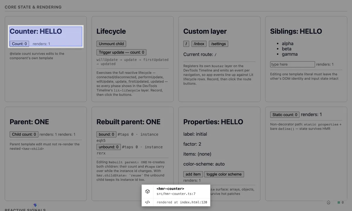
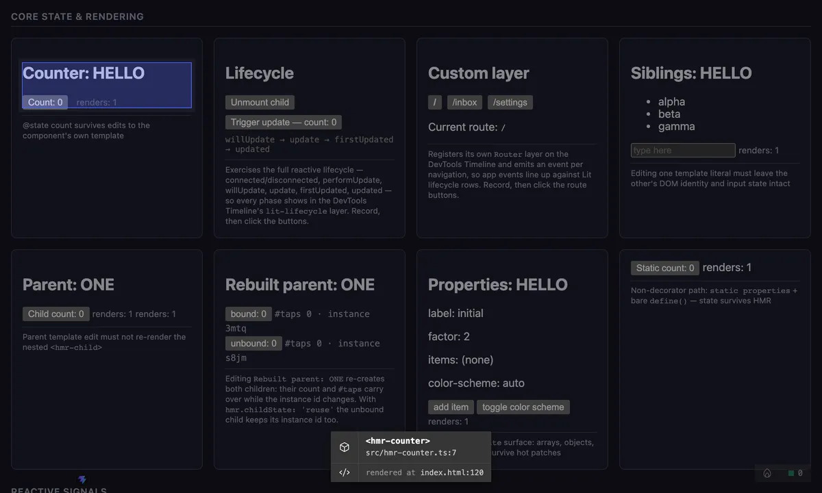
This is the same picker the source
overlay uses, so it needs
sourceOverlay switched on; without it the button is not shown. A page
connected to lit-devtools dev gets a
picker of its own that targets any Lit element, without source locations.
Set sourceOverlay.hosts
to 'lit' to pick a component library’s elements under Vite too. A plain click selects the element here in the
tree; hold Ctrl or ⌘ while clicking to open it in your editor instead.
Follow changes live
Section titled “Follow changes live”Live is on by default: a MutationObserver in the page re-pushes the tree
as the component hierarchy changes, including inside shadow roots. Changes to
text and plain markup are ignored, so they cost no tree rebuild.
Toggle Live off to pause the tree, for example to click through a list that keeps re-rendering, or to keep the observer’s work out of a timeline recording on a heavy page. Pausing takes one last snapshot of the tree; turning Live back on brings it up to date. The choice is remembered per browser.
Closing the panel stops the page observer, and reopening it with Live on starts it again. A panel opened as its own tab, rather than docked in the page, cannot tell the page it closed, so there Live keeps observing until the page reloads or you toggle Live off.
Flash elements that update
Section titled “Flash elements that update”⚡ Flash draws a short fading outline over every Lit element that finishes an update, so re-render churn shows up on the page itself rather than only in the Updates tab. It is off by default and does not depend on recording. Leave it on while you click around and the components doing more work than you expected announce themselves.
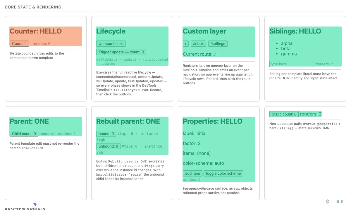
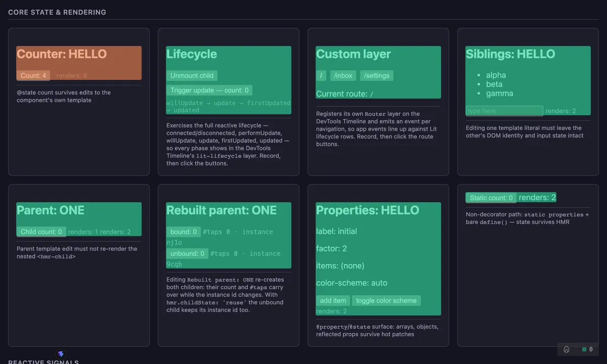
The outlines are drawn into one pointer-events: none layer, so the page stays
fully interactive underneath. Every element that updated in a frame is measured
together: a tick that updates a hundred components costs one layout, not a
hundred.
The optional flash updates ramp, in the Settings tab and available only while Flash is on, colours each outline by how often that element updated in the last second. Green for one, yellow at two, orange at four, red at eight.
Both preferences live in the settings override, so the page picks them up at boot and they survive a reload.
See an element’s slots and parts
Section titled “See an element’s slots and parts”Anatomy draws the selected element’s composition on the page: a grey
outline round the element, one coloured region per slot, and a dashed box per
::part export. Each region carries a label such as slot "title",
default slot or ::part(body). The toggle follows the selection, so picking
another element moves the drawing with it. The panel remembers the toggle, so
Anatomy left on is still on after a reload.
A <slot> has no box of its own, so each region is the bounding box of what
the slot renders: the light children assigned to it, or its fallback content.
A slot that renders nothing gets no region. The boxes are redrawn every frame
while Anatomy is on, so they follow scrolling and content changes.
The details pane lists the same slots and parts with matching colour swatches.
Each slot row names the elements assigned to it; click an element to select
it. Badges mark a slot that is empty, one that shows its own fallback
content, one whose content is forwarded from an enclosing component’s slot,
and a duplicate name that never receives content. Light children that no
slot takes are listed in red as not rendered, which catches a misspelled
slot attribute or a missing default slot. The root line under the tag
says when an element renders into light DOM, has a closed shadow root, or
sets delegatesFocus.
The Parts list also includes parts a nested component forwards with
exportparts, marked forwarded. A renamed one (exportparts="body: card-body")
is listed under its outer name, and the tooltip on the badge gives the inner one.
Forwarding is followed up to four components deep.
With Anatomy on, hover a slot or part row to find its region on the page. The region gains a ring and the others fade until the pointer leaves the row.
The tables refresh when the element updates, and whenever a slot’s assignment changes, so moving a light child into another slot or adding and removing children updates the Slots table without a re-render. A child that asks for a slot the element does not have changes no assignment; click the element again to refresh the not rendered list.
When the tree is empty
Section titled “When the tree is empty”An empty tree names its cause instead of one generic line. The tab says when the page runtime has not connected to the dev server, when more than one copy of lit is loaded, and when the runtime is inside an iframe; otherwise it reports that no Lit components were found. Each case has a fix in Troubleshooting.
The Settings tab ends with an About section: the plugin version, the lit
version or versions the page loaded, the timeline layers, whether the element
picker is available, and the order settings resolve in (panel override, plugin
option, LIT_PLUGIN_* env, default). Check it first when something looks off.